In this Photoshop Effects tutorial, we're going to learn how to use a photo as a layer mask, essentially using the image to mask itself, something that Photoshop doesn't normally allow us to do. We'll be using it to give the image a nice soft glow effect, but if you experiment on your own, you'll find lots of creative ways to use this technique.
CROSS MEDIA
This blog covers design and technology in the broadest sense possible. It's the place I collect designers thoughts, work and findings to share with the public.
The Basics of Branding
Branding is one of the most important aspects of any business, large or small, retail or B2B. An effective brand strategy gives you a major edge in increasingly competitive markets. But what exactly does "branding" mean? How does it affect a small business like yours?
Simply put, your brand is your promise to your customer. It tells them what they can expect from your products and services, and it differentiates your offering from your competitors'. Your brand is derived from who you are, who you want to be and who people perceive you to be.
Are you the innovative maverick in your industry? Or the experienced, reliable one? Is your product the high-cost, high-quality option, or the low-cost, high-value option? You can't be both, and you can't be all things to all people. Who you are should be based to some extent on who your target customers want and need you to be.
The foundation of your brand is your logo. Your website, packaging and promotional materials--all of which should integrate your logo--communicate your brand.
Ten ways to build a brand for your small business
Branding is just as important for small businesses as it is for big names. Indeed, many corporate brands try to look more like small firms in order to appeal to consumers that prefer to support independent brands.
Principles Of Design And How To Use Them
GRAPHIC DESIGN TECHNOLOGY
Graphic Design Technology comprises many different skills and disciplines in the production of graphic design and output. The diversity of the skills required in the industry are very broad: it is common for people working in this field to be specialists in a particular aspect. As a result, a team may cover the Graphic Design Technology process, with each member of the team having their own strengths, specialities and roles.
Graphic Design Technology involves working with external and internal clients to create solutions to their needs; it may also include the printing or online publication production. People working in this industry often work closely with their clients and must be strong communicators so that they can achieve the client’s objectives successfully. They require strong interactive, research, design and technical skills. In order to have these they need to understand the target audience, markets, trends and cultural differences and what the client wants. They must be able to work in either formal or informal teams, or stand-alone.
After completing the research and planning stage, a project is interpreted to form a design in appropriate industry specific software. The design must be set up with the correct technical specifications for output or online publication. It is essential that practitioners understand all phases of the procedure including the constraints of the specified printing process. These skills also apply to re-designing or updating a design.
There are various employment opportunities within the industry. This can include becoming a freelancer, business owner, or being employed by an advertising firm, a design firm, a printing company or a company with a design department. Practitioners may have a broad role, or specialise as a graphic designer, graphic artist, prepress operator, typographer, typesetter, type designer, image manipulation specialist, illustrator, art director, production manager, digital printer, information designer, publisher or packaging specialist.
Standards Specification
The Standards Specification specifies the knowledge, understanding and specific skills that underpin international best practice in technical and vocational performance. It should reflect a shared global understanding of what the associated work role(s) or occupation(s) represent for industry and business.
Creating an environmentally friendly Green Type Leaf
Create a Leaf
Step 1
Now we're going to create some leaves. Start by drawing a leaf shape with the Pen Tool (P). Again, with the Pen Tool (P), draw a line that starts at the tip of leaf and ends in the middle of the bottom part of the leaf. After selecting the line and the leaf shape, press the Divide button in the Pathfinder panel, located on the bottom left side of the panel. Ungroup (Command + Shift + G) the objects so you have two separate shapes.Creating an environmentally friendly Green Type Treatment
1. Create a Waterdrop
Next come the water droplets. Create an oblong ellipse with the Ellipse Tool (L). Then create a Linear Gradient using the same colors as the leaf and text. Adjust the gradient so the dark side is on the bottom left.
Create another ellipse on top of the previous ellipse and create a Radial Gradient with the same swatches as the highlight gradient. Adjust this gradient so the light part of the gradient is coming from the bottom left.
Create another ellipse on top of the previous ellipse and create a Radial Gradient with the same swatches as the highlight gradient. Adjust this gradient so the light part of the gradient is coming from the bottom left.
What’s New with InDesign CC
Small tweaks and fixes—along with a new file format—mark the 12th major version of InDesign.
Adobe seems to have some confusion about dates. Throughout 2016, the most up-to-date versions of InDesign CC have been called InDesign CC 2015. Now, just before the end of 2016, a new version arrives called InDesign CC 2017 (Figure 1). I think we can attribute this to the strange quirks of Adobe Marketing.This new version is significant because it’s a major update that requires a new file format version. This means that if someone using InDesign CC 2017 creates a new file, and you open it using an earlier version of InDesign CC, the Creative Cloud will convert the file to your older version. (There were five versions of InDesign CC 2015. No conversion was necessary between those versions.) If you’re unfamiliar with the process, I’ll explain how it works at the end of the article.

Figure 1: Do not adjust your calendars; “2017” is arriving a little early.
The A to Z of Adobe InDesign

Adobe InDesign is a diverse software programme for creating beautiful designs for print and digital. Most designers will have a tried-and-trusted set of InDesign tools they consistently use in their daily workflow (guilty!), but aside from the ever-faithful features there are also some exciting tools and tips you may not know about.
Whether you’re a newbie to the programme or a seasoned InDesign professional, there may be something in the following list that you haven’t yet discovered or used. Click the links to access detailed tutorials on some of InDesign's features.
Want to point out any more InDesign tools/tips/features that aren’t included here? Share them in the Comments below!
How to Create a Simple Geometrical Pattern in Adobe Illustrator

What You'll Be Creating
In this Quick Tip tutorial, I'm going to show you how to create a simple and trendy geometrical pattern, the quick and easy way. First, we will create a special repeating shape, and then we will move this object using the Smart Guides tool. In the end, we will have a pretty and modern pattern that we'll recolor.
In this Quick Tip tutorial, I'm going to show you how to create a simple and trendy geometrical pattern, the quick and easy way. First, we will create a special repeating shape, and then we will move this object using the Smart Guides tool. In the end, we will have a pretty and modern pattern that we'll recolor.
Convert Illustrator artwork to grayscale
I'm often asked how to turn full color Illustrator artwork into a grayscale equivalent. This is simple if you know where to look:
1. Open your color .ai or .eps file in Adobe Illustrator CS3/CS4
2. Select the artwork that you want to convert to grayscale
3. Choose Edit > Edit Colors > Convert to Grayscale
That's all there is to it. If the colors in your original artwork don't map to pleasing grays, you can try one or more of the following to adjust the tonal values of the grays:
* Convert your file from CMYK to RGB or vice versa by choosing File > Document Color Mode before you convert it to grayscale. Even though the colors may not look much different in RGB or CMYK on the screen, they will convert to different grayscale tones.
* Choose Edit > Edit Colors > Adjust Color Balance before or after you convert the artwork to grayscale
* Choose Edit > Edit Colors > Saturate after you convert the artwork to grayscale.
Illustrator Tip: Duplicate a shape along a circle
This is one of those little workflows that can be a complete pain on the rare occasion that you need it. So I’m making this as much as a reminder for myself and our design team as it is a tutorial.

30 Photoshop secrets to improve your skills
Power up your skills as we reveal 30 Photoshop secrets that will increase your productivity overnight.
Once you've overcome the beginners' learning curve, however, there are some real gems hidden inside Photoshop that can help you speed up your work and get more out for less effort. Here we've rounded up 30 of the best Photoshop secrets to help sharpen your skills and improve your productivity.
Photo Manipulate an Eye Catching Poster Design for Earth Hour
Photo Manipulate an Eye Catching Poster Design for Earth Hour
In this tutorial, we will learn how to create an conceptual earth hour photo-manipulation. We are going to learn the process of creating depth of field using a few advanced tools. We are going to learn how to blend images so seamlessly that it would look like a single image using the Brush tool, masking tools and several adjustment layers. We will learn how to create light and darkness to make the background look seamless. We are going to learn how to use textures and give life to our image, and we are going to learn how to create a moody, dreamy tone using a few adjustment layers and lighting effects.
Apply shading to alternate rows in a worksheet
This article shows you how to automatically apply shading to every other row in a worksheet. You can apply the shading by using a simple conditional formatting formula. Alternatively, you can apply a predefined Excel table style to your data.
=MOD(ROW(),2)=0
On the worksheet, do one of the following:
To apply the shading to a specific range of cells, select the cells you want to format.
To apply the shading to the entire worksheet, click the Select All button.

Technique 1: Apply shading to alternate rows by using conditional formatting
One way to apply shading to alternate rows in your worksheet is by creating a conditional formatting rule. This rule uses a formula to determine whether a row is even or odd numbered, and then applies the shading accordingly. The formula is shown here:=MOD(ROW(),2)=0
On the worksheet, do one of the following:
To apply the shading to a specific range of cells, select the cells you want to format.
To apply the shading to the entire worksheet, click the Select All button.
Alphabetizing Menus in InDesign
Ever have trouble finding a particular item in one of InDesign's menus? Maybe you know the item is there somewhere, but can't quickly locate it. Or maybe you just think it was there, but you're not really sure. In either case, you can track down the item faster by displaying menu items in alphabetical order.
To do that, just hold Command+Shift+Option/Ctrl+Shift+Alt before clicking on the menu title. Alphabetizing a menu also removes the divider lines that group related items together.
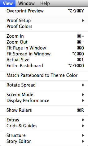
View Menu normal order
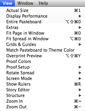
View Menu alphabetized
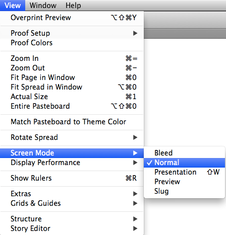
Or you can just view a submenu in alphabetical order by pressing Command+Shift+Option/Ctrl+Shift+Alt before clicking on the submenu.
To do that, just hold Command+Shift+Option/Ctrl+Shift+Alt before clicking on the menu title. Alphabetizing a menu also removes the divider lines that group related items together.

View Menu normal order

View Menu alphabetized
Or you can just view a submenu in alphabetical order by pressing Command+Shift+Option/Ctrl+Shift+Alt before clicking on the submenu.

Corner Stroke Effects
Ever wish you could make a stroke only applied to the corners of an object? Here's how.
Use the Stroke panel to create a new dashed stroke style. For now, just give it a name and click OK.
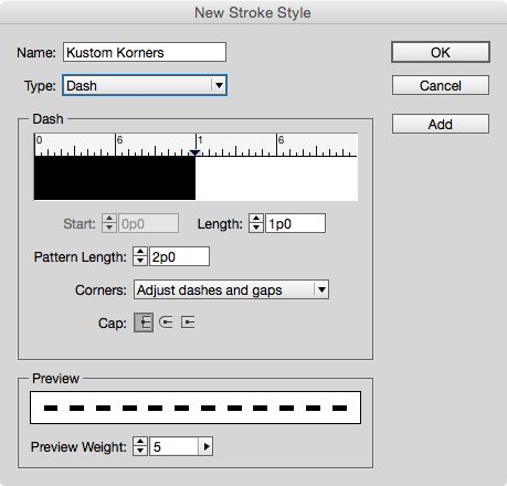
Next, apply your new stroke style to an object in your layout with the desired stroke width.
Reopen the Stroke Styles dialog box and double-click on your new stroke style to edit it.
In the dialog box, set the Pattern Length to a large value (larger than any frame you expect to apply the stroke style to). For the Corners option, choose Adjust Gaps.
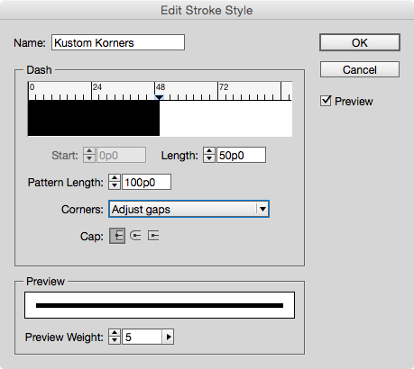
Make sure Preview is selected, and then just the Length value until you see the desired effect.
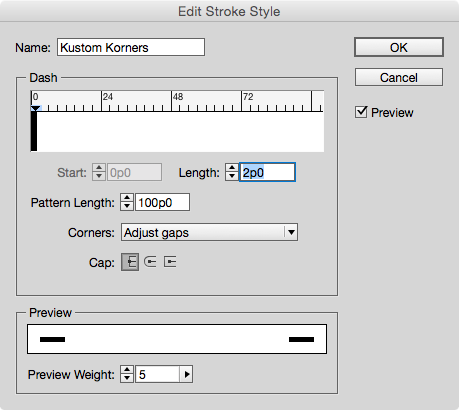
By playing with the values, you can make strokes that appear only in the corners of objects, or even strokes that appear to bracket frames.


Use the Stroke panel to create a new dashed stroke style. For now, just give it a name and click OK.

Next, apply your new stroke style to an object in your layout with the desired stroke width.
Reopen the Stroke Styles dialog box and double-click on your new stroke style to edit it.
In the dialog box, set the Pattern Length to a large value (larger than any frame you expect to apply the stroke style to). For the Corners option, choose Adjust Gaps.

Make sure Preview is selected, and then just the Length value until you see the desired effect.

By playing with the values, you can make strokes that appear only in the corners of objects, or even strokes that appear to bracket frames.


Reordering Paragraphs With GREP in InDesign
Ever have a sequence of paragraphs that you needed to put in a different order? If it's just one or two paragraphs, you could copy and paste. But what if you need to make the same change dozens, or even hundreds of times? In that case, it's time to use a little GREP Find/Change. The key is to use the Found Text expression.
Here's a sequence of paragraphs of contact information.

Say you needed to rearrange the last two paragraphs so the email address comes before the Twitter handle. No problem.
Open the Find/Change dialog box and click on the GREP tab. In Find What, search for a sequence of five paragraphs using the expression, one or more of any character, followed by an end of paragraph .+\r
Enter this five times and put each one in parentheses to group them into separate sub-expressions.

Now rearrange the sub-expressions by replacing them with the code for Found Text 1-5, indicated by dollar sign plus the number. And simply put the fifth found item $5before the fourth $4.

Run the find/change and voila, the information is reordered.
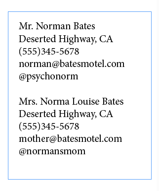
The one "gotcha" you have to be careful of is that GREP find/change will mess up any text formatting you have applied to individual words or paragraphs. So you should do this before you apply formatting!
Here's a sequence of paragraphs of contact information.

Say you needed to rearrange the last two paragraphs so the email address comes before the Twitter handle. No problem.
Open the Find/Change dialog box and click on the GREP tab. In Find What, search for a sequence of five paragraphs using the expression, one or more of any character, followed by an end of paragraph .+\r
Enter this five times and put each one in parentheses to group them into separate sub-expressions.

Now rearrange the sub-expressions by replacing them with the code for Found Text 1-5, indicated by dollar sign plus the number. And simply put the fifth found item $5before the fourth $4.

Run the find/change and voila, the information is reordered.

The one "gotcha" you have to be careful of is that GREP find/change will mess up any text formatting you have applied to individual words or paragraphs. So you should do this before you apply formatting!
Give your black and white art the outline it's missing
Give your black and white art the outline it's missing
While line art works best in the stained glass technique, don't let a good design slip by because it doesn't have an adequate outline. If you have a design with a lot of solid areas of black, it's easy to transform that into more refined line art for this technique. We'll show you how using Photoshop's custom shape, Ornament 2.To create the custom shape:
- Press D to set the default foreground color to black.
- Choose the Custom Shape tool from the Tools panel.
- Click the Fill Pixels button on the Custom Shape tool options bar.
- Choose Ornament 2 from the Shape preset picker, located in the Ornaments set of the Custom Shape Presets.
- Press and hold down [shift], and draw the custom shape on your canvas.
To refine the lines:
- Select the Magic Wand tool from the Tools panel.
- Deselect the Contiguous check box and set the Tolerance to a low number; we used 1.
- Click on an area that's black to select all the black pixels in the shape.
- Choose Select > Modify > Contract.
- Enter 10 in the Contract By text box and click OK. Depending on the resolution and complexity of your image, you may need to enter a different amount.
- Press [delete] ([Backspace] in Windows) to delete the extraneous black pixels.
Don't flip flop between RGB and CMYK (CS3/CS4/CS5/CS6)
Multiple conversions between RGB and CMYK color space can degrade your image file since Photoshop rounds off the color values each time it makes a conversion. The best workflow is to make all of your image adjustments in RGB mode, then convert images to CMYK if you need the files separated that way for printing purposes.Quickly select a table & display table headings at the top of every page in MS Word
Display table headings at the top of every page in MS Word
When you create a lengthy table, Word doesn't display the table's headings (i.e., the table's first row) at the top of each page that contains a portion of the table. This can make multi-page tables hard to read. However, you can easily configure Word to repeat a table's heading row wherever the table breaks across pages.If you'd like to use just the first row of your table as a repeated heading, place the insertion point anywhere within the table's first row. Or, if you'd like to use more than one of the table's top rows as your table headings, select them first. Next, choose Table | Heading Rows Repeat from the menu bar.
Subscribe to:
Comments (Atom)

