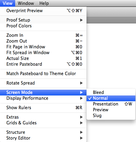
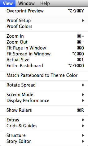
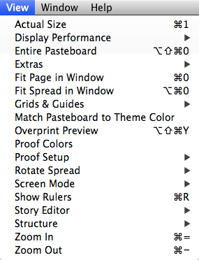
Ever have trouble finding a particular item in one of InDesign's menus? Maybe you know the item is there somewhere, but can't quickly locate it. Or maybe you just think it was there, but you're not really sure. In either case, you can track down the item faster by displaying menu items in alphabetical order.
To do that, just hold Command+Shift+Option/Ctrl+Shift+Alt before clicking on the menu title. Alphabetizing a menu also removes the divider lines that group related items together.
View Menu normal order
View Menu alphabetized
Or you can just view a submenu in alphabetical order by pressing Command+Shift+Option/Ctrl+Shift+Alt before clicking on the submenu.
This blog covers design and technology in the broadest sense possible. It's the place I collect designers thoughts, work and findings to share with the public.
Corner Stroke Effects
Ever wish you could make a stroke only applied to the corners of an object? Here's how.
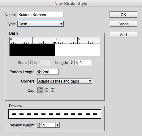
Use the Stroke panel to create a new dashed stroke style. For now, just give it a name and click OK.
Next, apply your new stroke style to an object in your layout with the desired stroke width.
Reopen the Stroke Styles dialog box and double-click on your new stroke style to edit it.
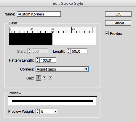
In the dialog box, set the Pattern Length to a large value (larger than any frame you expect to apply the stroke style to). For the Corners option, choose Adjust Gaps.
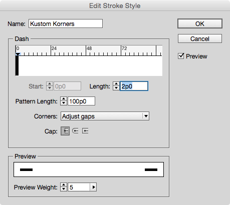
Make sure Preview is selected, and then just the Length value until you see the desired effect.
By playing with the values, you can make strokes that appear only in the corners of objects, or even strokes that appear to bracket frames.
Reordering Paragraphs With GREP in InDesign
Ever have a sequence of paragraphs that you needed to put in a different order? If it's just one or two paragraphs, you could copy and paste. But what if you need to make the same change dozens, or even hundreds of times? In that case, it's time to use a little GREP Find/Change. The key is to use the Found Text expression.
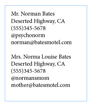
Here's a sequence of paragraphs of contact information.
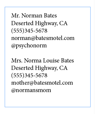
Say you needed to rearrange the last two paragraphs so the email address comes before the Twitter handle. No problem.
Open the Find/Change dialog box and click on the GREP tab. In Find What, search for a sequence of five paragraphs using the expression, one or more of any character, followed by an end of paragraph .+\r
Enter this five times and put each one in parentheses to group them into separate sub-expressions.
Now rearrange the sub-expressions by replacing them with the code for Found Text 1-5, indicated by dollar sign plus the number. And simply put the fifth found item $5before the fourth $4.
Run the find/change and voila, the information is reordered.
The one "gotcha" you have to be careful of is that GREP find/change will mess up any text formatting you have applied to individual words or paragraphs. So you should do this before you apply formatting!
Give your black and white art the outline it's missing
While line art works best in the stained glass technique, don't let a good design slip by because it doesn't have an adequate outline. If you have a design with a lot of solid areas of black, it's easy to transform that into more refined line art for this technique. We'll show you how using Photoshop's custom shape, Ornament 2.To create the custom shape:
- Press D to set the default foreground color to black.
- Choose the Custom Shape tool from the Tools panel.
- Click the Fill Pixels button on the Custom Shape tool options bar.
- Choose Ornament 2 from the Shape preset picker, located in the Ornaments set of the Custom Shape Presets.
- Press and hold down [shift], and draw the custom shape on your canvas.
To refine the lines:
- Select the Magic Wand tool from the Tools panel.
- Deselect the Contiguous check box and set the Tolerance to a low number; we used 1.
- Click on an area that's black to select all the black pixels in the shape.
- Choose Select > Modify > Contract.
- Enter 10 in the Contract By text box and click OK. Depending on the resolution and complexity of your image, you may need to enter a different amount.
- Press [delete] ([Backspace] in Windows) to delete the extraneous black pixels.
Don't flip flop between RGB and CMYK (CS3/CS4/CS5/CS6)
Multiple conversions between RGB and CMYK color space can degrade your image file since Photoshop rounds off the color values each time it makes a conversion. The best workflow is to make all of your image adjustments in RGB mode, then convert images to CMYK if you need the files separated that way for printing purposes.Quickly select a table & display table headings at the top of every page in MS Word
Display table headings at the top of every page in MS Word
When you create a lengthy table, Word doesn't display the table's headings (i.e., the table's first row) at the top of each page that contains a portion of the table. This can make multi-page tables hard to read. However, you can easily configure Word to repeat a table's heading row wherever the table breaks across pages.If you'd like to use just the first row of your table as a repeated heading, place the insertion point anywhere within the table's first row. Or, if you'd like to use more than one of the table's top rows as your table headings, select them first. Next, choose Table | Heading Rows Repeat from the menu bar.
Zoom to a specific magnification without the Zoom tool in QuarkXPress
You don’t need to select the Zoom tool to zoom in or out on your layout page. Instead, press [ctrl]V ([Ctrl][Alt]V) in Windows) and type the zoom magnification you want Quark to display. For example, if you want to zoom out to 50 percent magnification, type 50 and press [return] ([Enter] in Windows). If you want to zoom in to 200 percent magnification, type 200 and press return ([Enter] in Windows).
Easy way to import an image into QuarkXPress
To import an image into a QuarkXPress document, you don’t need to first create a picture box. You can easily just choose File > Import, or press [command]E ([Ctrl]E in Windows) to open the Import dialog box. But if you do decide to draw the picture box first, you still have options. Not only can you use the same import commands, but you can also double-click on the picture box to open the Import dialog box. Before you do, however, make sure the Picture Content tool is selected in the Toolbox!Advanced Hair Selection Using Channels in Photoshop
Masking out images with complex edges from their background in Photoshop can be daunting for some designers and Photoshop users — especially working on images with very detailed edges and textures that even Photoshop’s pen tool, at its finest, can’t handle. Good thing Photoshop never ran out of ways to make things easier for us.
In this short tutorial, I will show you an old but reliable method of masking out complex images using Photoshop’s channels. This is a great tip for all the newbies and even for intermediate users out there so heads up!
Revealing Hidden Objects With Preflight Profiles
Normally, once you hide an object in an InDesign document (via Object > Hide, pressing Command+3/Ctrl+3, or clicking the object’s Show/Hide button in the Layers panel), it leaves few traces of its presence. Hidden objects aren’t printed or exported, and they won’t show up in a Find/Change. They can, however, still affect other objects with text wrap.
But if you really want to give these objects nowhere to hide, use a preflight profile to reveal them.
From the Preflight Panel menu, choose Define Profiles. Click the + (plus) button to create a new preflight profile. Give your new profile a name, and in the IMAGES and OBJECTS options, select Hidden Page Items (plus whatever other conditions you want InDesign to check for).
Click OK, and then select your new profile from the panel menu. If there are any hidden objects, they will be listed as errors and you can double-click them in the panel to jump to their location in the document.
But you still won't see them until you show them (by pressing Command+Option+3/Ctrl+Alt+3, or choosing Object > Show All on Spread, or clicking the object’s Show/Hide button in the Layers panel).
With tools like these you can be the World Champion of Hide and Seek
(at least inside InDesign).
Using Gridify With Multi-Page Documents
Did you ever need to create a grid of pages from a multi-page document, like perhaps thumbnail images of pages from a book?
InDesign's Gridify feature seems like the perfect tool for this job, but if you try it with a multi-page document like a PDF, it seems not to work (you can only draw one frame at a time instead of a grid of them). But there are two simple tricks you can use to make the magic happen and create a grid of pages.
1. When you select your multi-page file for placing (PDF, INDD, or AI), turn on the Create Static Captions checkbox in the Place dialog box.
2. Or simply select a second file to place in addition to the multi-page document.
With either method, make sure you also select Show Import Options (or hold down the Shift key when you click Open in the Place dialog box) so you can select All pages.
Then use Gridify as normal: click and drag to define the height and width of the grid, and use your keyboard arrow keys to define the number of rows and columns.
If possible, make a grid with the exact number of pages you want to place. Then just switch to a different tool to dump either the captions or the extra file (the one that you loaded just to trick the Gridify feature into working).
If the number of pages in the document you're placing is less than the number of frames in your grid, you'll have to delete the extraneous captions/image.
Rotation: Clockwise or Counter-clockwise?
Have you ever had that moment of doubt as to which direction InDesign’s rotation angle is going to move your object? Are positive numbers clockwise or counter-clockwise?
I can’t remember myself, but there’s a little cheat that helps me look smart in front of a class. Just take a quick peek at the Rotation tool in the Tools panel. Notice that it indicates a counter-clockwise direction.
That’s your clue that positive numbers rotate objects counter-clockwise.
Negative numbers go clockwise.
This half-second glance saves me a lot of undos.
Super Fast Table Editing in Adobe InDesign
Want to change the number of rows or columns in a table really fast?
With the Type tool, move your cursor over the bottom or right edge of the table. When the cursor changes to a double arrow, click and hold, then press and hold Option/Alt and drag to the right to create more columns. Or drag down to create more rows.
This trick works in reverse too, so you can remove rows and columns by dragging up or to the left while holding Option/Alt.
Create a multi-layered file from a folder of images super fast in Photoshop
If you have a folder of images that you want to put into one Photoshop document, Photoshop comes with a preinstalled script that will make this job a snap! Simply choose File > Scripts > Load Files Into Stack to display the Load Layers dialog box. Choose Folder from the use pop-up menu, then click the Browse button and browse until you find the folder of images you want. Select the folder and then click Choose. The file names will display in the preview pane of the dialog box. (At this point, you can also select any from the list you decide you don’t want and click Remove.) When you are satisfied with the image list, click OK and Photoshop creates a new document with all of those images, each on a separate layer. One word of caution, make sure the folder isn’t full of more high resolution images than your CPU and RAM are capable of having open at one time.
Add the [shift] modifier for more color options in Illustrator
The Control panel offers you an array of choices at your fingertips. For example, the Fill and Stroke option boxes have pop-up menus, which each give you a mini Swatches panel from which you can choose colors. Want even more choices? Press and hold [shift] when you click either of these two option boxes and Illustrator will display the Color panel with mixing options based on your document’s color space.
Disabling the SSID Broadcast on Wi-Fi router
In the Wi-Fi networking, the wireless access point or router have a habit of broadcasting the network name (SSID) over the air at regular periods. This unique feature was conceptualized for all the businesses and mobile hotspots wherein the Wi-Fi clients may have to roam in and out of range. In the home network, this type of roaming feature is absolutely unnecessary, as it will increase the potential of someone trying to access your home network, thus posing a security risk. Most of the times, Wi-Fi access points will allow the SSID broadcast feature that will be disabled by the administrator.
Always Change Default Settings Of Wireless Router
Always change default settings of a new wireless router. This includes – SSID name, admin username & password, wireless security method, encryption key etc. as they are not secure.
What to expect when controlling router configuration from a remote program
If you're writing software to manage or alter a network, one task you may need to do is to programmatically alter router configurations or enable and disable ports, using a remote connection. This may seem like a difficult problem. However, there's a special extension of the Tcl scripting language that you can use for this purpose, called Expect. Expect can automate telnet, ssh, and other command-line network protocols to manage remote routers and servers. Expect scripts are also useful for the initial configuration of routers, as they don't rely on SNMP already being enabled.
Make sure to enable MAC Address Filtering on your wireless router
Each and every Wi-Fi router or access point contains a special identifier known as the physical address or MAC address. Access points and routers have a tendency of keeping track of all the MAC addresses of every kind of device that is connected to them. Numerous such kind of products are offering the owner a unique option to key in the MAC addresses of their home equipment, that will restrict the network to only give permit to connections from those devices, thereby ensuring a safe and sound home network.
The fastest way to duplicate a layer in Photoshop
You can click and drag a layer to the Create A New Layer button at the base of the Layers panel to create a duplicate of that Layer. But with a keyboard combination and a slight nudge, you can do the job even more quickly. Just press and hold [command][option] ([Ctrl][Alt] in Windows) and then click on any layer thumbnail in the Layers panel and drag it slightly in any direction and release. Photoshop will create a duplicate of that layer in the Layers panel in the blink of an eye!
Scale both strokes and fills the same
One of the great benefits to Illustrator artwork is the ability to scale it to any size without increasing the file size. Of course, frustration abounds when you increase or decrease a graphic but the stroke doesn't scale in synch with the fill. (By default, the stroke stays the same when scaled.) Not to worry, there's an easy fix to keep the elements scaling in proportion with each other; you just have to set the preference. Simply choose Edit > Preferences > General. Select the Scale Strokes and Effects check box, and click OK. And if you are using the Scale Tool, make sure to set the option there as well. Simply double-click on the Scale Tool, and in the resulting Scale dialog box select Scale Strokes & Effects.
Drag to Copy Swatches
Need to copy a bunch of color swatches from one open InDesign document to another? There's no faster way than drag and drop!
Just arrange the two documents on your screen so you can see them both (a quick way to do this is to choose the 2-up option from the Arrange Documents pop-up in the Application Bar).
Then click in the document containing the swatches you want to copy. Select the swatches by Shift-clicking to select a range, or Command/Ctrl-clicking to select ones that aren’t next to each other.
Then drag and drop the swatches from the panel into the receiving document. Just don’t start dragging from one of the little colored squares or only that one swatch will be copied over. Drag from anywhere else on the selected swatches to copy them all.
Select Pages Before Moving Them
You can move or copy pages from one document to another by choosing Layout > Pages > Move Pages.
And you can make the process even easier by first selecting the pages you want to move in the Pages panel.
Then, when you open Move Pages dialog box, those pages will be already entered for you.
And you can make the process even easier by first selecting the pages you want to move in the Pages panel.
Then, when you open Move Pages dialog box, those pages will be already entered for you.
InDesign Tips: Better-Looking Drop Shadows
Even in this age of Flat Design, you occasionally need to add a drop shadow or two to make items pop. When you do, add a little noise—just 3–5% is plenty in most cases—to create a more natural-looking effect.
Creating Spot Color Swatches
To quickly create a spot color swatch, just hold down the Control (Windows) or Command (Mac OS) key on the keyboard while clicking the New Swatch button at the bottom of the Swatches panel.
If you want to edit the name or color values of the new swatch, press Alt+Control (Windows) or Option+Command (Mac OS) when you click the New Swatch button to open the Swatch Options dialog box.
Instant Violators in InDesign
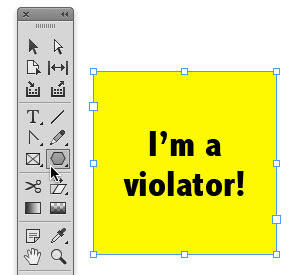
Did you know that starbursts, banners, color bars, and similar attention-getting design elements are also called “violators”? This is because they violate the underlying design to attract your eye.
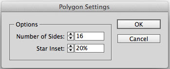
And in InDesign, you can convert a selected object into a starburst simply by double-clicking the Polygon tool and choosing the desired number of sides and star inset.
InDesign Tips- Reveal Tracking and Kerning
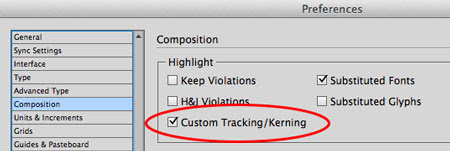
Ever receive a document and the text looks suspiciously squished in certain places? Suspect some rogue tracking has taken place? You can instantly reveal all tracking and kerning by going to Composition Preferences and choosing Highlight Custom Tracking/Kerning.
Manually applied tracking and kerning appears in dark green.
Tracking applied as part of a paragraph or character style appears in light green.
Manually applied tracking and kerning appears in dark green.
Tracking applied as part of a paragraph or character style appears in light green.
Adding Styles via Find/Change in InDesign
Did you know that you can add a style to an InDesign document via Find/Change?
Here’s how. Start in a document that contains the style.
Open Find/Change and specify the style in the Change Format section of the dialog box. (You also have to specify something in the Find what and/or Find Format sections.)
Switch to the document that doesn’t have the style, and run the Find/Change.
When you click either Change or Change All, the style is added to the document.
This way, you don’t have perform the extra step of creating or loading the style into the second document before running the Find/Change. InDesign assumes that if you’re asking to apply the style, you must want to add it.
Move a layer mask independently from the layer in Photoshop
Layers are an integral part of advanced image editing. Sometimes you need that mask in a precise location, protecting specific portions of your image from further editing or simply hiding them. But there may come a time when you want to nudge the mask—but not the layer it's masking—to a different location. With the layer mask selected, if you choose the Move tool and try to move the mask, the layer will move along with it. To move the mask but not the layer, you need to unlink the two. Simply click the chain icon in the Layers panel that sits between the layer thumbnail and the layer mask thumbnail. Then you can select either the mask thumbnail or the layer thumbnail and move it independently of the other.
Rotate your page view, not your head in InDesign
It's true, as designers we love software that allows us to lay out page elements however we want, including rotating text. Well, there's even more to love because you don't have to cramp your neck trying to read that rotated text! You can rotate the page preview so you can read, edit, align, and adjust however you want—then rotate it back. To do this, simply select the page in the Pages panel that you wish to rotate. Then click on the Pages panel pop-up menu and select Rotate Spread View and choose one of the options (90º CW, 90º CCW, or 180º). When you are finished editing, with that page in the Pages panel still selected, click on the Pages panel pop-up menu and choose Rotate Spread View > Clear Rotation. Who said designing had to be difficult?!
Make CSS3 animations stay put after they're performed
Animations are one of the most excÃting features of CSS3. They allow you to display various moving pÃctures to the user without Flash, JavaScript, or even images. This can be particularly helpful in situations where Flash may not be available, such as on iPhones. One problem with animations, however, is that by default, they snap back to their original position once the animation is finished. That's the opposite of what typically happens when creating an animation with jQuery or Flash-based tools such as Adobe Captivate. Since animations are often used to transition from one state to another, you'll likely want the fÃnal frame of the animation to stay put, just as you'd expect from these other tools.
Fortunately, there's a way to make CSS3 keep the property setting at the end of the animation and not have the elements "snap back" to their original state. Simply use the animation-fill-mode property (and its -webkit- equivalent for Chrome and Safari browsers). By setting it to "forwards", you can cause the animation to freeze in its fÃnal position when it's finished:
animation-fill-mode:forwards;
-webkit-animation-fill-mode:forwards;
One caveat is that it matters where you put this property. To ensure that it has an effect (in supporting browsers), place the property after you declare the animation's duration.
Specify the context of JavaScript's "this" with call, apply, and bind
One of the most ubiquitous and also confusing keywords in current JavaScript practice is "this." As you may know, "this" refers to the object performing executÃon in the current context. Unfortunately, this can cause confusion and be difficult to control, as (just as in an English sentence), "this" may be vague, or it may refer to one thing when you really need it to refer to another.
Fortunately, JavaScript has a solution for this. Instead of calling functions containing "this" the normal way (e.g., by name followed by parentheses), just call the function's built-in "call" or "apply" methods (i.e., built-in in the sense that all functions inherit them from Function.prototype). This allows you to specify what you want "this" to refer to. That not only helps make clear what "this" is, but also allows you to force "this" to signify any particular object that you like.
The first argument of "call" and "apply" is the object you want "this" to be. The remaining arguments of "call" are simply your function's parameters (in order). The "apply" method has just two arguments, where the second one is an array specifying your function's parameters. This gives "apply" an advantage in that if you add more parameters to your function, you don't need to necessarily change all the calls made with "apply." The following are two equivalent examples:
myFunction.call(myObject, argument1, argument2);
myFunction.apply(myObject, [argument1, argument2]);
A third way to specify the meaning of "this" is to use the built-in "bind" method, which has syntax similar to "call" but returns a new function instead of immediately executing your function. Use "bind" when you want to prepare a version of your function (bound to a specific object) for later use (e.g., like putting it in the fridge instead of eating it right away). For example, the following codé creates a new function and then uses it to perform the same actions as the codé above:
var myBoundFunction = myFunction.bind(myObject, argument1, argument2);
myBoundFunction();
Note that unlike "call" and "apply," the "bind" method is new as of ECMAScript 5. Hence, you can't use it in IE8, Chrome 6, or other earlier browser versions unless you employ a polyfill.
Tips for New Feature: Typography Settings
Word 2010 supports four types of OpenType font features:
- Home > Font launcher button > Font dialog > Advanced Tab
- Ligatures – Specially designed decorative flourishes
- Number Spacing – Tabular, fixed, or proportional
- Number Forms – Height of numbers relative to the text in which they are embedded
- Stylistic Sets – Alternative renderings of the characters in a font
How To Insert Hyperlinks
Hyperlinks add the capability of moving from one position to another quickly and easily, such as linking to another slide, another file, or even to a web site.
One advantage of hyperlinking to a separate file is that the size of the presentation file remains smaller than if the file was inserted into the presentation. A disadvantage of linking separate files is that if the name of the linked document changes or if it is moved into a different directory, the link will be broken and the information will not be accessible.
- Highlight the text or graphics to link
- Insert Tab > Links command group > Hyperlink
- Choose the target (Place in this document)
- Choose the slide
One advantage of hyperlinking to a separate file is that the size of the presentation file remains smaller than if the file was inserted into the presentation. A disadvantage of linking separate files is that if the name of the linked document changes or if it is moved into a different directory, the link will be broken and the information will not be accessible.
Removing Acne, Skin Blemishes With The Spot Healing Brush In Photoshop
In this Photo Retouching tutorial, we’ll look at one of the most amazing and time saving photo retouching tools available, the Spot Healing Brush, the first of three image "healing" tools in Photoshop. The Spot Healing Brush was first introduced in Photoshop CS2 and, like the other two healing tools (the standard Healing Brush and the Patch Tool), it’s essentially a texture replacement tool, meaning that it tries to create a seamless repair by replacing damaged or unwanted texture from one area in an image with good texture from another area, without changing the problem area’s original color or brightness values. What makes the Spot Healing Brush so amazing and fast is that it does this with almost no effort from us!
Printing Terms
Before we begin, printing has an unusual terminology that is attached to it. Below is a small list of terms you will run into when talking with your printer. Although not totally complete, the terms listed below will get you well on your way to understanding your printer and the language that they use.
Preparing InDesign Files for your Print Service
Often times when it comes to preparing files for a printer it can get really complicated really fast. Often times when I’m creating a design there are a lot of elements that I use in a file, most of which are images and fonts. It’s so complicated to remember EVERYTHING you put into a file so I discovered this cool trick you can use in InDesign to help package up all of your information for you! That way you don’t have to worry about missing anything. The function is called packaging. Here is how to package a file and what it does exactly.
Tricks for vector brush graphics
In this tutorial, I will show you a few vector brush tricks that will allow you to create some quick, easy, and super-cool effects in Adobe Illustrator. I use this technique all the time to create custom ornamental borders, frames, and background patterns.
Here is the final product I'll be showing you how to create:
Easily Smooth And Soften Skin In A Photo With Photoshop
In this Photoshop tutorial, we’ll learn an easy way to soften and smooth someone’s skin in a photo without blurring out important image details, such as the person’s eyes and mouth. The technique we’ll be looking at is actually a slight variation on a method normally used for advanced image sharpening, which serves as a great example of why it’s much more important to understand what you’re doing rather than simply memorizing a bunch of steps or "recipes". The more you understand what you’re doing in Photoshop and why, the more your mind will open to new ideas and new possibilities.
How to Create a Chart in Word from Table Data
- Select data within the table to chart. Copy the data – not the totals. Click outside the table where the chart will be placed.
- Insert > Illustrations command group > Chart.
- A chart gallery appears. Select a chart type. Click OK.
- A sample series spreadsheet "Chart in MS Office Word" appears.
- Clear the data in the sample chart. Click in A1 to paste the original data into the spreadsheet, replacing the existing sample data. If you don't clear the sample data, it may be necessary to delete sample data rows or columns.
- A chart redraws in Word to reflect the original data. Close the spreadsheet window.
- Resize the chart as needed, stretching or shrinking with the corner handles.
- To edit the spreadsheet data, click once on the chart to activate it. Click on the Edit Data button (Chart Tools contextual tab > Data command group > Edit Data).
Create a Realistic 3D Sphere Logo from Scratch Using CorelDraw
In this tutorial you’ll learn how to make a realistic 3d sphere logo. This tutorial is for designers who use CorelDraw as their main software. This kind of logo works well for technology focused companies, as it has a high-tech feel. After working through this tutorial you’ll be able to create similar designs in your work.
Adobe InDesign Tips I Wish I’d Known When Starting Out
I love Adobe InDesign. For multi-page documents, it’s the most flexible and complete application out there. Yet I remember how counter-intuitive some things were when I was learning it for the first time. Here are some tips I wish I had known when starting out, as well as some answers to questions that others often ask me. This is not intended to be a manual; some good ones are already out there (although I personally learned by doing). Hopefully, these tips will help you make the best of your day-to-day use of InDesign.
Margins And Bleeds
If you are preparing a document for print, keep your margins and bleeds in mind from the beginning. Your printer will give you the measurements for the bleed, but generally 1/8 inch or 3 mm should suffice. Approximately the same area within the document should be kept free of text and important graphic elements (such as the logo). Set up your document for bleed in InDesign as you create it by selecting the correct settings in the document set-up box.
Conditional Text and InDesign CS4
InDesign has always supported the use of layers, but layers don’t always cut it when working with text. You can put a text frame on a layer and turn that layer on and off as needed, but it’s an all or nothing approach. What if you want to show and hide individual words or paragraphs and have the text automatically rewrap when you show or hide those words? With conditional text, it’s a breeze.
1 [FIRST, WE’LL NEED A NEW DOCUMENT]
You can certainly use one of your existing documents for this, but if you’re going to follow along, you might want to go ahead and create a new document. Choose New>Document from the File menu. One page should be fine.3D Printing With Photoshop CC
Adobe has been building increasingly sophisticated 3D modeling tools into Photoshop, and this month’s release of Photoshop CC (14.2) offers the most powerful techniques yet. Now the program has been updated with the ability to generate reliable models suitable for 3D printing. And if you have a 3D printer connected to your computer, you can print those models directly from the application.
What’s New in Adobe Illustrator CC
In my opinion, there are some pretty useful updates to Illustrator CC 17.1 (January 2014). We now can finally round the corners on our paths easily and even create custom panels for tools we use all the time. There are even enhancements to age-old features and tools like the Pencil and Pen tools, and how we edit paths, among a variety of other enhancements. In this article, we’ll explore the most interesting of these new and improved features in this newest release of Illustrator CC 17.1. I’ve even included links to some videos I created for the larger feature updates, that go into a little more depth.
How to Create a Professional Magazine Layout
Have you ever wondered how professional designers strike the perfect balance between text and image? Using InDesign’s powerful type tools, you will learn techniques to help you set and arrange a magazine layout.
Step 1 Setting up the Document
We’ll be using a standard A4 size document for this tutorial. Start with setting the number of pages to 8, the bleed to 2 mm so we have some space for images to overlap, the margins to 10 mm for top and bottom, the inside margin to 13 mm and the outside margin to 20 mm. The reason for these different margins is that in a spread with 2 pages a slightly larger margin on the outside of the page looks better and provides space to hold the printed version. It is also useful for the page grid in the next step.
Creating and Applying Master Pages in InDesign
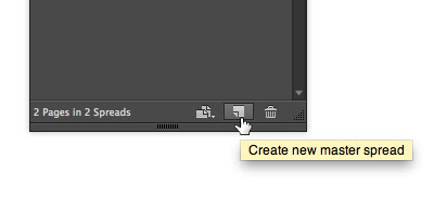
The shortcut for creating a new master page is to Command/Ctrl-click the New button at the bottom of the Pages panel.
But if you want to name it, or base it on another master page, add the Option/Alt key, too!
Then, when you want to apply that master page to one or more document pages, select those pages in the Pages panel (Command/Ctrl click on each one to select more than one discontiguous page) and Option/Alt click on the master page at the top of the Pages panel.
Add Image Captions Fast in InDesign
The captions features in InDesign are cool, but if you already have dozens or even hundreds of images on multiple InDesign pages, you might be thinking “hmm, I need to select images if I want to add captions, so I guess I will be selecting all the
images, page by page.” Wrong! Instead, there is one place in InDesign that allows you to target all the images in the file at the same time and apply captions to them?
Defining a Symbol Registration Point in Adobe Illustrator CS5
One of the best things about Adobe Illustrator CS5 is the amount of control for placing a registration point for points. With earlier versions of Adobe Illustrator, the point registration for a point is in the centre extent dimension (make a rectangular shape for the point's extent, then place a point at the centre.)
Here's a quick example of this. We start with a simple graphic, the green flag shown below.
Reset the Zero Point in Adobe InDesign
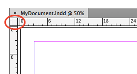
It's easy to change the zero-zero point of the document rulers: Just drag from the corner where the two rulers meet and let go of the mouse button where on your page (or pasteboard) you want the zero-zero point to sit.
But how do you get the zero-zero point back to the upper-left corner? No problem: Double-click that little square where the rulers meet to reset back to the ruler default position.
Subscribe to:
Posts (Atom)