
The Column Graph
Not a lot of people are aware of the fact that Illustrator has a tool for generating graphs. While being very useful, the graphs it generates are not really visually interesting…

But let me first introduce you to the basics of this tool. You’ll find it on the tools panel just below the symbol tools. Click and hold the left mouse button over it, and it will reveal the list of all graphs it can create for you.
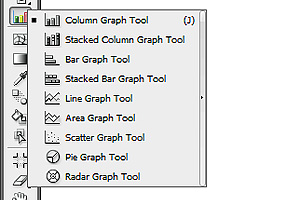
As you can seethere is a pretty big list of graphs you can generate. In this tutorial I’ll talk about three most popular types: column graph, pie graph and line graph.
So now, please select the Column Graph Tool and draw your first graph.
Step 1
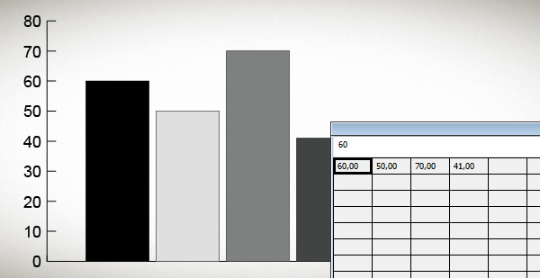
After drawing the graph you’ll be greeted with a window that resembles a spreadsheet. Well in fact, it is a spreadsheet Just input some numbers in a horizontal fashion and click OK.
Step 2
We’ve got our first graph on the screen, now it’s time to give it some style. I’ll show you how to draw a shape which we’ll later use as a graphic style for the columns.
Close the spreadsheet and hide the layer with the graph, you won’t need it right now. Create a new layer, draw a square on it and fill it with a gradient (#DBF9FF to #00BCE0, angle: -137).

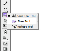
Copy the square, and double click on the shear tool (you’ll find it under the pencil and rotate tool) to shear the object 55 degrees horizontally.
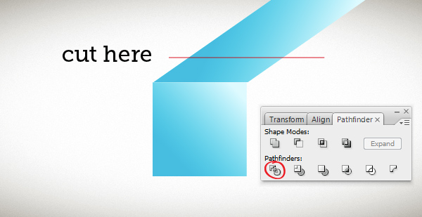
Position it like in the picture below. Then draw a straight line as indicated in the picture. Select both, the sheared square and the line, go to Pathfinder and use the Divide option.
Delete the unnecessary part of the rectangle, play with the gradient settings (I just changed the angle) and you’ll be left with that:

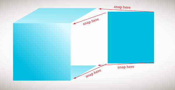
To create the third wall, you need to draw a newrectangle, turn on the Smart Guides option (ctrl/cmd+U), copy the top wall of the cube and align it with the bottom of the front wall.

Then using the Smart Guides snapping feature, position each corner of the rectangle as indicated below.
You should get something like in the picture below. Delete the lower part of the cube, we won’t need it any more, and give the new wall a dark blue gradient (Irecommend using the Edit Colors option in the Color Guide panel for this).

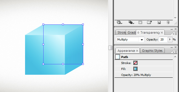
To fake the cubestransparency we need to copy the front side and align it like in the picture below.

Now give the rectangle a pure white to dark blue gradient (#FFFFFF to #00B0D8, angle:0). Go to the Transparency panel, turn on the Multiply mode and lower the rectangles opacity to 20%.
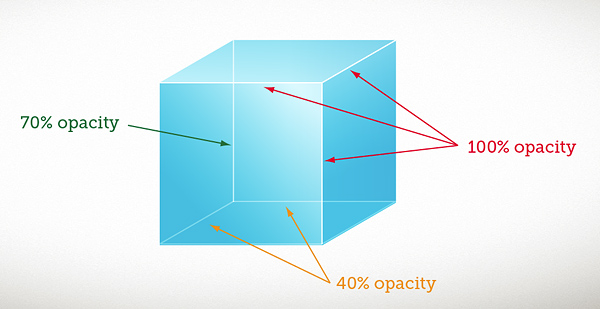
In this step we’ll give some contrast to the cubes edges by drawing white strokes over them. So grab the pen tool and draw 1 pt thick strokes over the edges and adjust their opacity like in the picture below.
Now we’ll add a shine on the corner of the cube. To do so, take the Star Tool and draw a 4 pointed star. You can change the number of points by pressing up or down on your keyboard while you are holding the left mouse button. Position the star like in the picture and give it 80% opacity,

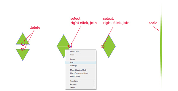
To add final touches to the star, draw two triangles with the Star Tool. Do it like in a previous step, just reduce the number of points to 3 by pressing the down arrow.
Position the triangles like in the picture. Select the bottomcentre points of each rectangle and delete them. Then put the triangles closer to one another. Select two rightmost points of each triangle, right click and select Join, do the same for two leftmost points. Then scale the joined triangles to get a thin pointy shape.
Duplicate the pointy shape. Give both shapes white color and position them like below.

Step 3
Style for the columns is ready. Now we need to take care of the most important part. Applying and configuring the graph design in Illustrator. There are four ways in which you can apply the style to a bar graph. Vertically scaled, uniformly scaled, repeating and sliding.
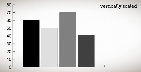

Now you’re probably wondering why didn’t I show the newly created style with the vertical scaling option? Let me show you.

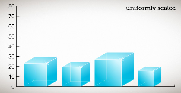
Looks pretty bad… When dealing with more complicated column designs it’s always better to use the sliding option because it enables you to specify which part of design you want to scale and which you want to leave unscaled.
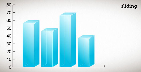
As you can see it looks good. Now let me show you, how you can prepare a design to be scaled this way.
Step 1.4
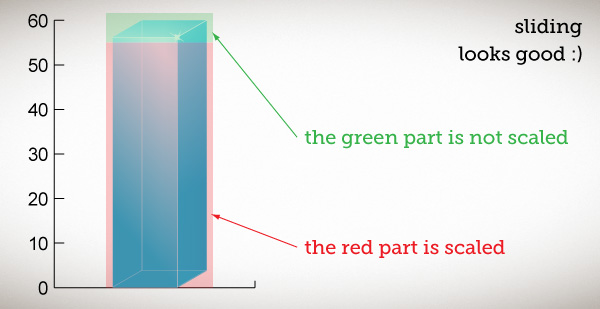
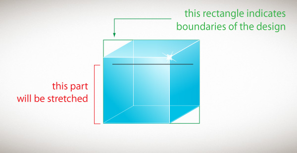
Lets get back to the cube we created a few steps earlier. To make our design scale properly using the sliding option we need todraw two things.
1. A rectangle which will indicate the boundaries of our design
2. straight line to define which part of the design will be stretched.
Draw the rectangle and the line just like you see them below:
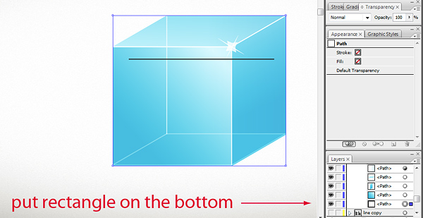
Now group everything (ctrl/cmd+G). Go to the layers panel and put the boundary rectangle at the very bottom of the group (this is very important!), the rectangle shouldn’t have any fill or stroke, so turn them off.
Select the black line with the Direct Selection Tool. Go to View>Guides>Make Guides or press ctrl/cmd+5. We need to convert this line into a guide or else it won’t work. This is the only way to show the Illustrator where to stretch the design.
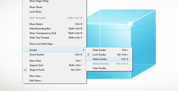
Now uncheck View>Guides>Lock Guides. It’s just for convenience, if the guides have been locked you wouldn’t be able to move the guide we just created.
Style for the columns is ready. Now we need to take care of the most important part. Applying and configuring the graph design in Illustrator. There are four ways in which you can apply the style to a bar graph. Vertically scaled, uniformly scaled, repeating and sliding.
Now you’re probably wondering why didn’t I show the newly created style with the vertical scaling option? Let me show you.
Looks pretty bad… When dealing with more complicated column designs it’s always better to use the sliding option because it enables you to specify which part of design you want to scale and which you want to leave unscaled.
As you can see it looks good. Now let me show you, how you can prepare a design to be scaled this way.
Step 1.4
Lets get back to the cube we created a few steps earlier. To make our design scale properly using the sliding option we need todraw two things.
1. A rectangle which will indicate the boundaries of our design
2. straight line to define which part of the design will be stretched.
Draw the rectangle and the line just like you see them below:
Now group everything (ctrl/cmd+G). Go to the layers panel and put the boundary rectangle at the very bottom of the group (this is very important!), the rectangle shouldn’t have any fill or stroke, so turn them off.
Select the black line with the Direct Selection Tool. Go to View>Guides>Make Guides or press ctrl/cmd+5. We need to convert this line into a guide or else it won’t work. This is the only way to show the Illustrator where to stretch the design.
Now uncheck View>Guides>Lock Guides. It’s just for convenience, if the guides have been locked you wouldn’t be able to move the guide we just created.
Step 5
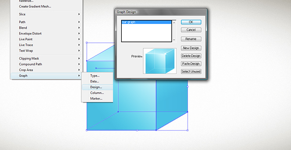
Select the group, go to Object>Graph>Design and click "New Design". Your design is now ready to be applied to the graph . You can also rename it by clicking the "Rename Design" button.
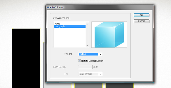
Delete the cube from the page area, make the graph we created earlier visible again and select it. Then go to Object>Graph>Column, select your design from the list, and choose Sliding from the drop down menu. Click OK.
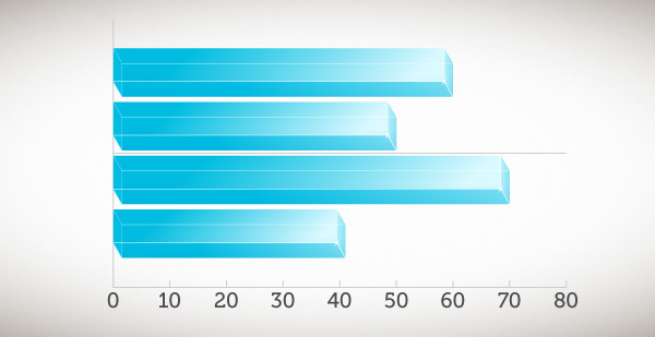
Your graph should look similar to this. If your columns seem to be too wide, change the Column Width parameter in Object>Graph>Type.

Creating graph designs may be a complicated task. If you can’t do it, justdownload the source files. You’ll find a ready made column design outside of the artboard in "bar_final.ai".
In this last step I added a few touches. I made some lines invisible, and changed the font. I also added the orizontal lines by using the Tick Marks option in Object>Graph>Type>Value Axis.
The graph is ready, and what is the most important, it’s editable, you can change column values or add newvalues to the spreadsheet and it will work just fine.

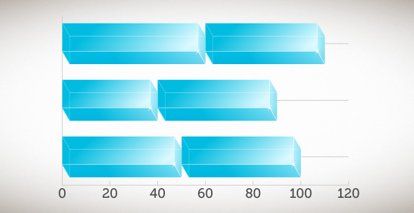
It’s worth noting that design we created will also work withdifferent types of graphs:Stacked Column Graph,Bar Graph and Stacked Bar Graph.

Select the group, go to Object>Graph>Design and click "New Design". Your design is now ready to be applied to the graph . You can also rename it by clicking the "Rename Design" button.
Delete the cube from the page area, make the graph we created earlier visible again and select it. Then go to Object>Graph>Column, select your design from the list, and choose Sliding from the drop down menu. Click OK.
Your graph should look similar to this. If your columns seem to be too wide, change the Column Width parameter in Object>Graph>Type.
Creating graph designs may be a complicated task. If you can’t do it, justdownload the source files. You’ll find a ready made column design outside of the artboard in "bar_final.ai".
In this last step I added a few touches. I made some lines invisible, and changed the font. I also added the orizontal lines by using the Tick Marks option in Object>Graph>Type>Value Axis.
The graph is ready, and what is the most important, it’s editable, you can change column values or add newvalues to the spreadsheet and it will work just fine.
It’s worth noting that design we created will also work withdifferent types of graphs:Stacked Column Graph,Bar Graph and Stacked Bar Graph.
No comments:
Post a Comment