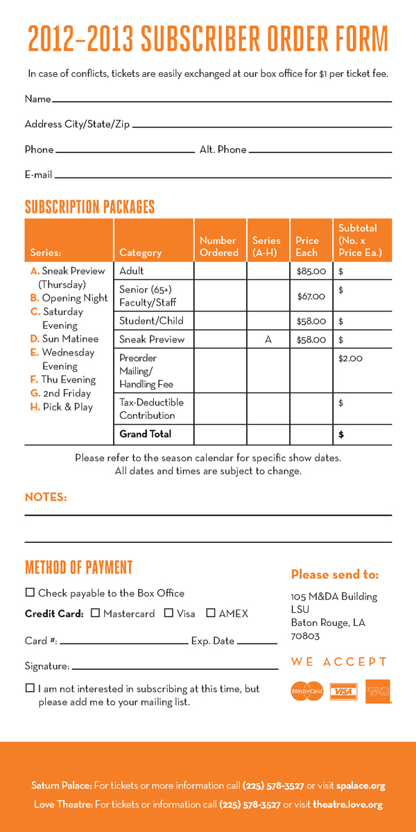
We’ll go through creating a simple form, but by no means does your design have to look exactly like this to get a form that works. Just follow the instructions on spacing and how to place form fields and otherwise do your own thing with it.
Step 1
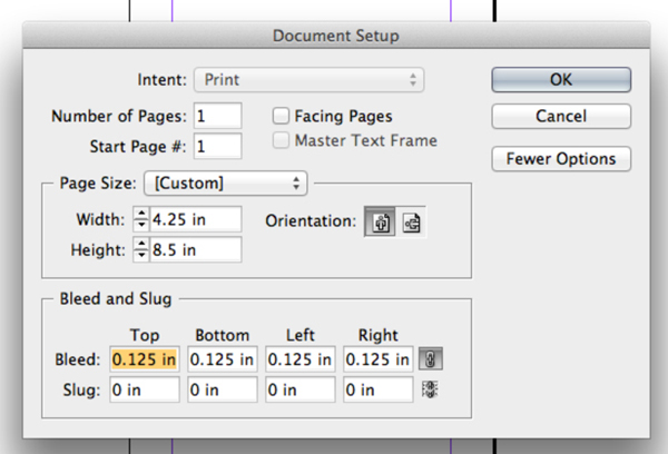
First create a new document in InDesign. Set up a file that is 4.25 in x 8.5 in. The form I am creating doubles as a printed mailer, so I am adding a standard bleed of 0.125 in.
Step 2
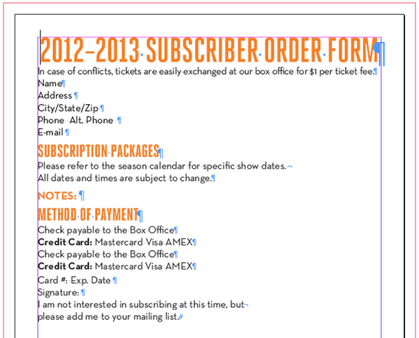
Now to typeset the form. Acrobat recognizes clear, legible text, so try to use a clean, legible typeface (such as Helvetica or another easy-to-read font) for the text that will precede the fields. The reason for this is so Acrobat can name the form elements accurately without getting confused. If your document has a headline or title, you can use a fancier font there, though.
Step 3
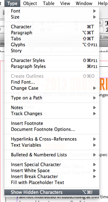
You want to be able to see where every tab and space is in the document so make sure you can see all hidden characters. To do this in InDesign, select Type > Show Hidden Characters.
Step 4
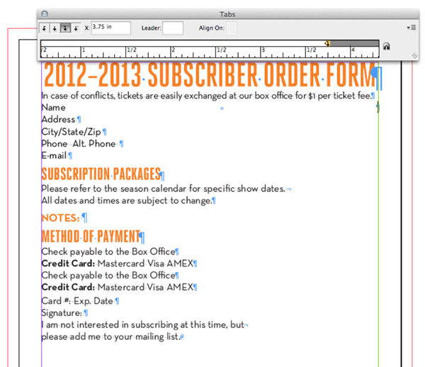
To add an easily editable underline to your form fields, select the space directly after the name of the field and insert a tab (Tab). Open the Tabs palette by selecting Type > Tabs. Select a Right-Justified Tab (the arrow pointing to the right and down) and click on the ruler in the Tabs palette to insert the tab. Now drag the tab all the way to the right margin and it should snap in place.
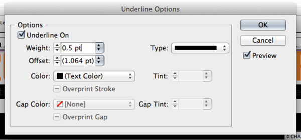
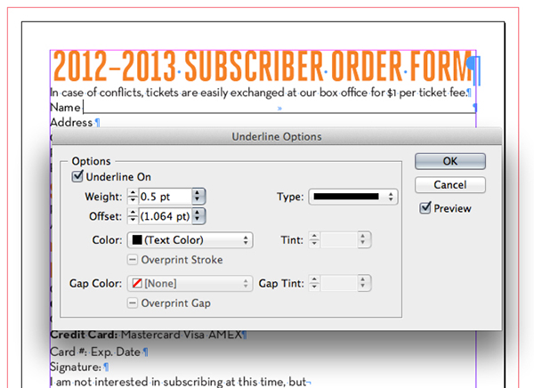
Highlight the Tab and open the Underline Options, which is accessed by clicking the icon in the upper right corner of the Character palette. Click the "Underline On" checkbox and set the underline weight to 0.5 pt. If the stroke is too thin, Acrobat won’t recognize it as a text field.
Step 5
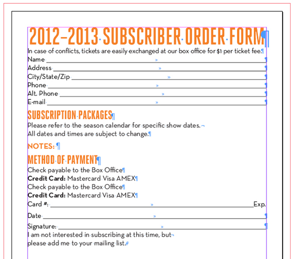
Add tabs to each field requiring underlines, then use the Eyedropper Tool (I) to apply it to the other fields by highlighting them.
Step 6
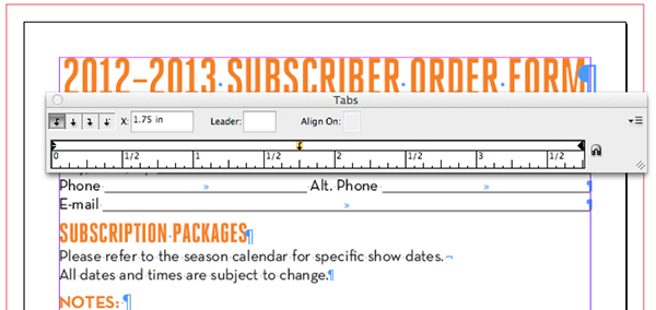
Not all fields need to take up the entire line, such as the phone number or zip/mailing code fields, and you’ll want to fit two fields on a single line. Do this by deleting the paragraph return on the first line and opening the Tabs palette again (Type > Tabs). Insert an additional tab by clicking the ruler and dragging it to the desired location.
Step 7
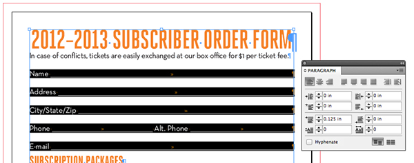
Now those fields are too cramped together! This will be problematic on the printed form when someone tries to fill it out by hand. I typically give it about 1⁄8 inch of headroom just to be sure. Place the cursor in the line you’re adjusting. You’ll then change the Space Before setting in the Paragraph palette to 0.125 in. Make sure all text fields have the same Space Before setting. I set the paragraphs without text fields to 0.625 in.
Step 8
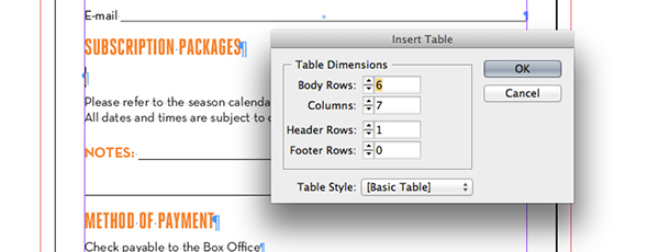
Next, set up a basic table by selecting the Type Tool (T), insert the cursor where the table will be placed, and then select Table > Insert Table. Choose the number of rows and columns you’ll need. For this form, I used six columns and seven rows, with one header row.
Step 9
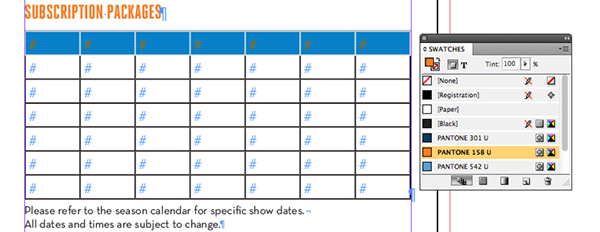
Now to format the table. I want the header row to be a similar orange color to maintain consistency with my color scheme. Highlight the header row by hovering over the left edge of the row with the Type Tool (T) until a black arrow appears, then click it. Change the Fill Color in the Swatches palette.
Step 10
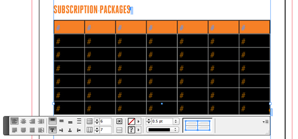
The best way to get fillable text boxes to be recognized by the OCR is to leave a blank white box surrounded by a black line. Highlight the body rows of the table and change the stroke weight to 0.5pt to match the weight of the text field underlines.
Step 11
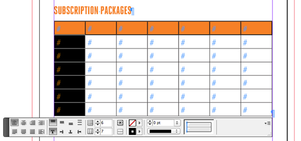
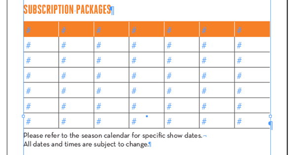
To make the table look less boxy, remove the stroke on the exterior of the table by highlighting the left column, then selecting only the left exterior stroke in the Property Inspector (pictured below) and setting Stroke Width to zero. Do the same to the right column to remove the opposite side. I also removed the black stroke around the header and changed the interior strokes to white.
Step 12
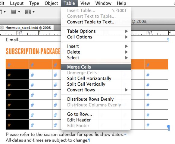
Merge the body cells in the left column by highlighting them and selecting Table > Merge Cells.
Step 13
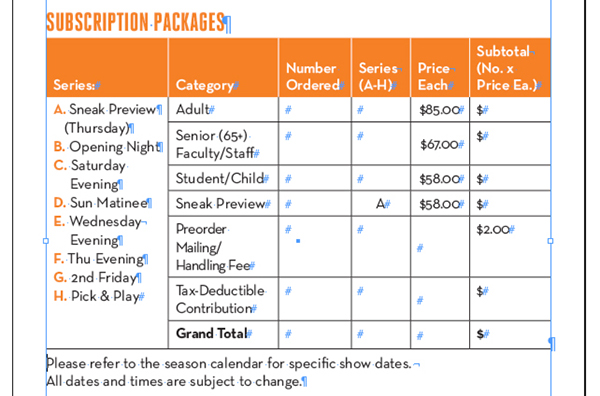
Insert your text into the table. Drag the edges of the cells so that they fit the text.
Step 14
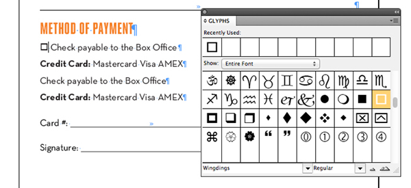
Now to add checkboxes. The OCR will generally recognize any small, empty square with a black stroke around it as a checkbox. Conversely, any circle with a black stroke will be recognized as a radio button. (The difference is that you can select multiple checkboxes but only one radio button.) The symbol font Wingdings has a black square and a black circle glyph that will work pretty well, but you will probably have to bump them up a few point sizes to match the height of the typeface you’re working with. Access the glyph you’re looking for under Type > Glyphs and select Wingdings.
Step 15
After adding few more graphical elements such as credit card logos and an orange accent at the bottom of the page, we are finished with the design! Time to turn this thing into a working form.
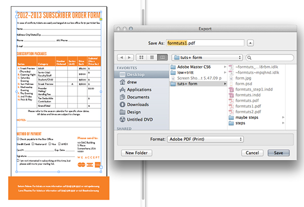
Select File > Export and choose to export as PDF (Print).
Step 16
Open the exported PDF in Adobe Acrobat.
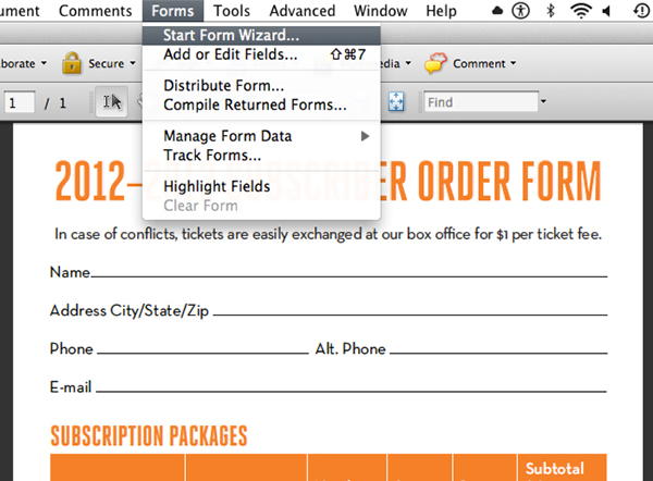
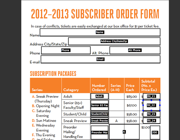
Now Select Forms > Start Form Wizard and choose "Use the current document or browse to a PDF file," then "Use the current document." Acrobat will instantly fill in the blank underlines and table cells with text fields and the checkboxes will become checkable.
Now Select Forms > Start Form Wizard and choose "Use the current document or browse to a PDF file," then "Use the current document." Acrobat will instantly fill in the blank underlines and table cells with text fields and the checkboxes will become checkable.
Step 17
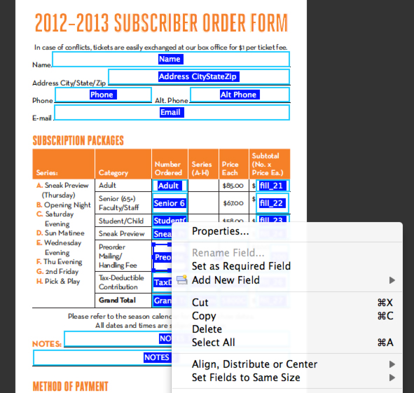
We’re not done yet! Acrobat has some difficulty parsing every field, so let’s check over them to make sure they’re correct. A quick method to ensure uniform formatting is to select all of the form fields at once and change them at the same time. Click-drag the mouse over all of the form fields (not the checkboxes or signature) and select stragglers with Command-click. Next, right click on one of the highlighted fields and select Properties.
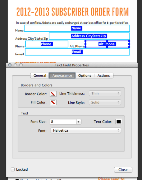
In the Appearance menu, set the font to Helvetica and the font size to 8. If the font size is left on the default setting of Auto, the text will resize according to the size of the text field and can look pretty ugly.
Step 18
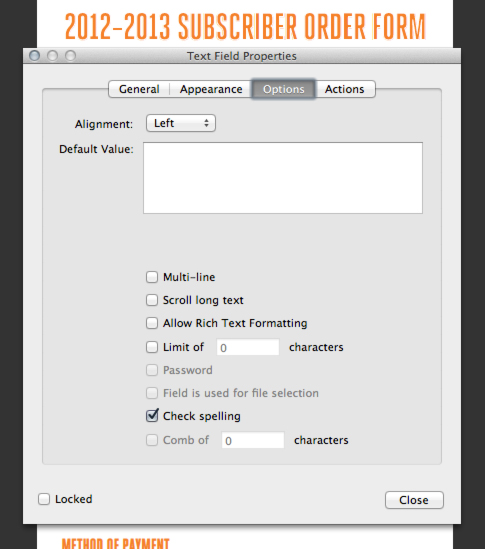
Switch to the Options menu. In some rare cases, Acrobat will set a character limit on a field. Uncheck the boxes next to "Limit of _ characters" and "Comb of _ characters" to avoid broken fields. Also turn off "Scroll long text" which limits the length of the text entered to the text field’s length, so the user can’t type a novel into your form.
Step 19
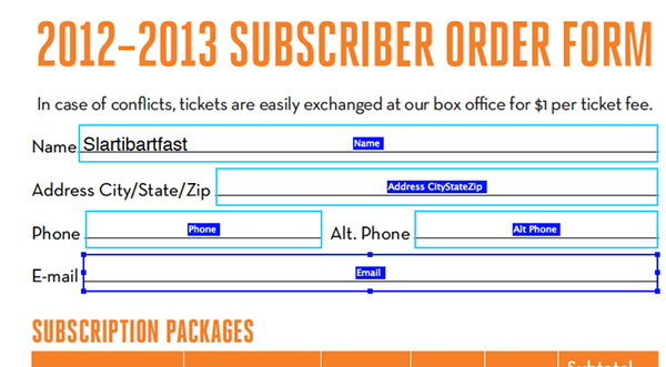
Acrobat tends to position the fields a little high above the baseline, causing further ugliness when entering text. To correct this, reselect the fields you want to lower and nudge them down with the arrow keys. The best way to test where the entered text will sit is by selecting Preview in the upper left hand corner of the window and typing some sample text.
Step 20
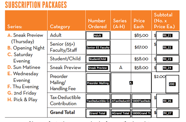
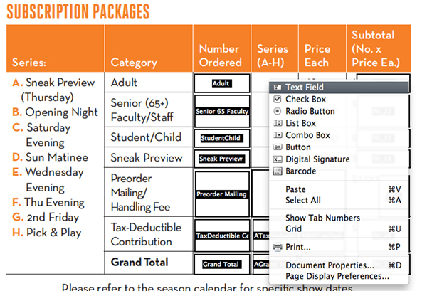
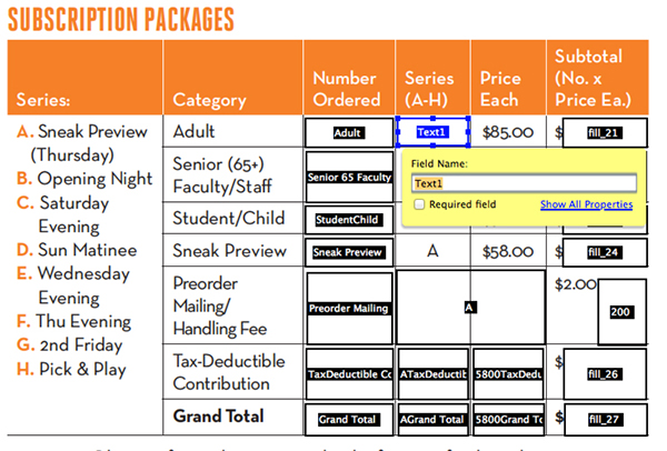
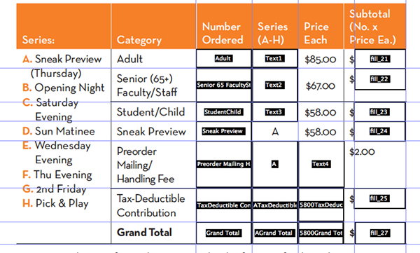
If you notice, the OCR didn’t fill in every blank in the table. This is common, and luckily it’s an easy fix. Click Add New Field in the upper left hand corner of the window and choose Text Box.
Now place and resize the field using the bounding box around the field. If you need a little help aligning the box with the other fields, turn on Rulers (Command + R) and drag a guide out from the ruler. Remove unwanted fields by selecting the field offender and hitting delete.
Step 21
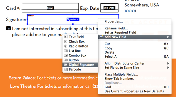
You can also set up a digital signature on the form if necessary. In this case, the OCR read the word signature and set it up automatically. If you need to set up additional signature fields, Select Add New Field > Signature.
Step 22
The Notes field will be an issue. Notice that it is split into two separate fields, but we want it to wrap to the next line. Acrobat is not a word processor, so there is absolutely no way to adjust leading (line spacing,) so the underlines can’t be lined up with the text, so we will remove the lines to make way for a multiline text field.
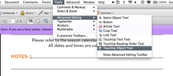
To remove the lines without going back into InDesign, click on Close Form Editing in the upper right corner of the window and go to Tools > Advanced Editing > TouchUp Object Tool. Now select each unwanted underline and hit Delete.
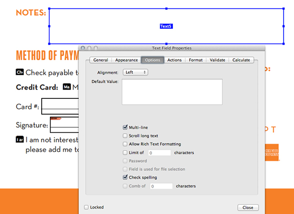
Back in Form Editing mode, delete the old text fields and create a new one big enough to accommodate two lines of text. Open the Properties of the text field and go to Appearance and check "Multiline". This allows the text to wrap to the next line.


Step 23
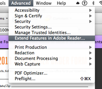
Once your form is clean and ready to send out, Click Close Form Editing, save your work, then select Advanced > Extend Privileges in Adobe Reader. If you skip this step, the user won’t be able to save entered text and it becomes a read-only file.
Tip: Make sure you are finished editing the form: once you extend privileges, the file is locked and you won’t be able to alter the design of the form. Make a backup with a different name, like "form_editable.pdf" or something like that.
Conclusion
Forms can be a hassle, but with practice, you can produce clean, easy-to-navigate PDFs with a few simple tweaks. Even if you have already worked with fillable forms, hopefully this tutorial has given you some suggestions to make the process a little easier. If you have any tips we didn’t go over today, let us hear them in the comments.
4 comments:
Thanks for providing the complete instructions to create this form. Now its easy for all to easily understand what is going at each step.
digital signature Adobe Acrobat
You can find fillable PDF forms that you need at PDFfiller.com
http://goo.gl/DHPSMT
You can edit your form, fill the text fields, add a variety of checkmarks, digitally eSign the PDF form and even add pictures. After your PDF form is completed, it can be printed, emailed, faxed or saved on your computer. You can even send fillable PDF forms to your customers, employees, vendors and partners.
Paperwork like a Curriculum Vitae although can simply be created utilizing a phrase file format however making the phrase doc accessible on each system turns into a bit troublesome as it isn't a really moveable format. Proposals and authorized paperwork may also be transformed utilizing phrase to PDF converter. If you want to learn more about this topic please visit https://2pdf.com/
Just a few video codecs are sufficient for many customers, however the very best video converter software program will provide a variety of customers a broad collection of output codecs. If you want to learn more about this topic please visit https://onlineconvertfree.com
Post a Comment